I hate minimalism design
03/06/2025

i feel like these days website, applicaton, graphic design is all the same? i mean the feeling, its FLAT. everything is using the minimalism website. i know it have more easy looking. but it just flat, like it has no soul. like damn, my parents age have a cool era, why i am born at this age LOL (it just a jk)
Everything today looks the same. It's all flat, minimalist, and overly "clean". White backgrounds, black text, soft gray buttons. Yes, it’s easy to navigate — I get that. But where’s the fun? Where’s the soul?
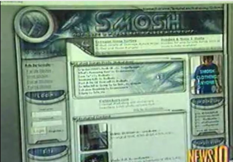
Back then, websites used to experiment. They had weird fonts, chaotic colors, animated GIFs, random music playing, loading bars shaped like slime — it was a digital jungle. And somehow, it had charm. Like the old Nickelodeon website? That thing was wild. It wasn’t "accessible" or "optimized", but it felt like you were stepping into a cartoon world. It had personality. and dayum, look at this old Smosh website!
Now it feels like every brand is scared of standing out. Everything is just... safe. Which also means: boring. fucking corporate design.
but hey.. i think its coming back
People are starting to appreciate Y2K aesthetics again. They’re collecting old iPods, customizing their Tumblr themes, and building personal blogs on Neocities (shoutout!). There’s something powerful about crafting a site that doesn’t follow a grid. One that’s messy, sparkly, and entirely yours.
Design isn’t just about looking nice. It’s about feeling something. And when everything looks like it came out of the same UI kit, it kind of numbs your brain. That’s why maximalist, experimental design is refreshing — because it reminds us that websites are not just tools. They’re also spaces. Creative spaces.
So if you feel like today’s internet is too flat, you’re not alone. Make weird stuff. Use weird fonts. Break grids. Add a blinking star background. Build something that’s unmistakably you.
and btw THIS IS MY OPINION 😊👍 i know some of you will say like "functionality over aesthetics!" but this is my opinion so... yeah
💬 Comments